
Comparison · KiwiMotion
GPT Image 2.5 Flare vs Sunburst: 4 Side-by-Side Tests
Compare GPT Image 2.5 Flare and Sunburst using the same prompts and settings across fashion, typography, product photography and information design.
By KiwiMotion ·
What are Flare and Sunburst?
OpenAI describes Flare as speed-oriented and Sunburst as quality-oriented. Those are model positioning statements, not measurements from these eight pictures. We generated each pair in KiwiMotion with exactly the same prompt, Medium quality, output dimensions and automatic background setting. Each side is one run, so this is an illustrative comparison, not a repeatability or latency benchmark.
Test 1 / matched prompt
Fashion photography
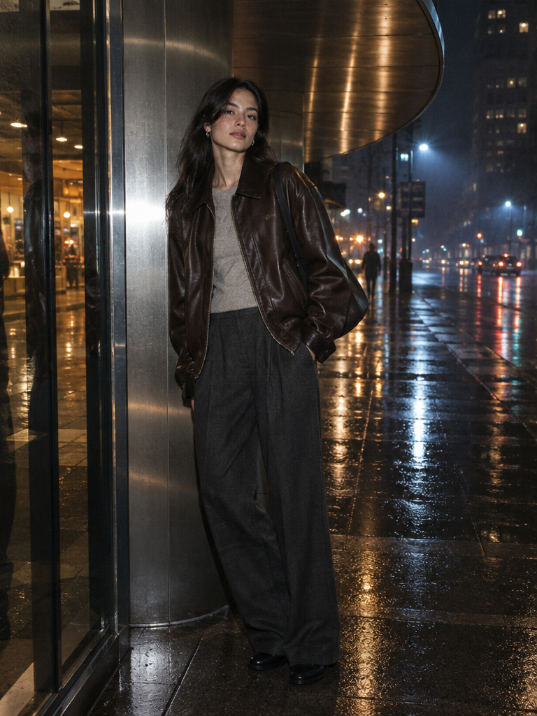
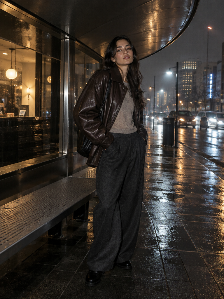
The same night-street direction tests skin, leather, wet reflections, and ambient light.
Same prompt · Medium quality · 768 × 1024 · Auto background · one generation per variant
In our two renders, Flare puts the model nearer a reflective wall and gives the wet pavement a long strip of light. Sunburst opens the frame toward the storefront, sidewalk and traffic, with more street context around the same leather-jacket brief. Both keep the nighttime fashion direction; neither is a controlled speed test.
Preview prompt
Create a premium nighttime fashion campaign featuring a fictional young woman standing beneath a curved brushed-steel shelter after rain.

She wears an oversized deep espresso leather jacket, a muted stone knit top, wide charcoal trousers, minimal silver jewelry, and understated black shoes. Her pose is relaxed and slightly asymmetric, one shoulder turned toward camera, with natural confident expression and realistic body proportions.

The surrounding city should feel contemporary but anonymous: wet pavement, soft amber shop-light reflections, distant cool-blue street illumination, subtle mist…
Test 2 / matched prompt
Typography poster
Identical art direction tests material realism, spacing, and an exact headline.
Same prompt · Medium quality · 768 × 1024 · Auto background · one generation per variant
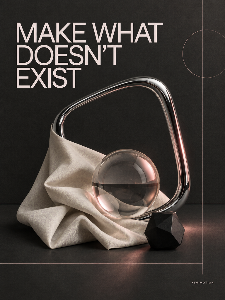
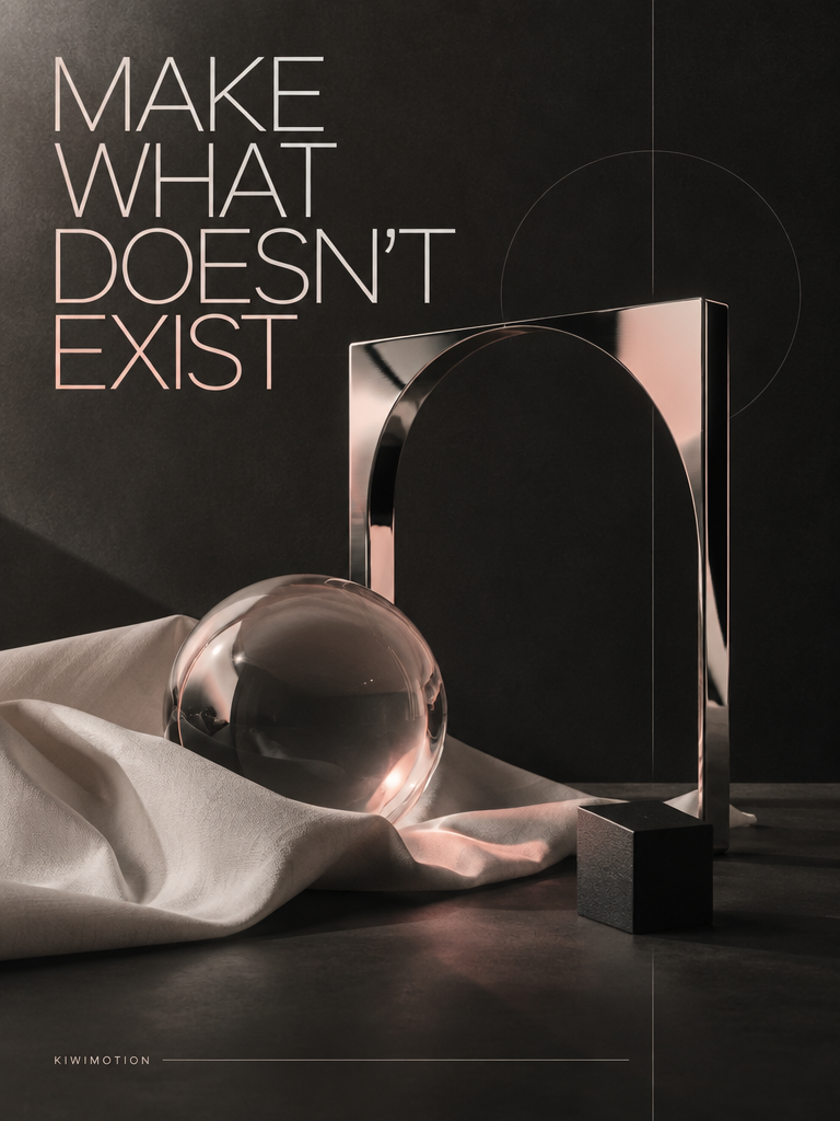
Both posters render the requested headline legibly. Flare groups it into a compact upper-left block beside a curved chrome form; Sunburst uses taller line breaks and a large rectangular frame behind the glass sphere. The difference here is layout and object arrangement, not a missing phrase.
Preview prompt
Create a premium editorial campaign poster for a fictional independent creative studio.

Dark charcoal background with a tactile matte-paper finish. Build the composition around one sculptural chrome frame, a translucent glass orb, folded off-white fabric, and one small black geometric object.

Use strict editorial spacing, subtle warm-pink light, thin structural lines, strong negative space, realistic materials, glass refraction and restrained studio shadows.

Render this headline EXACTLY ONCE:

"MAKE WHAT DOESN'T EXIST"

Render this small signature EXACTLY ONCE:

"KIWIMOTION"

The headline m…
Test 3 / matched prompt
Product photography
A fictional fragrance campaign tests glass, droplets, a small label, and atmosphere.
Same prompt · Medium quality · 768 × 1024 · Auto background · one generation per variant
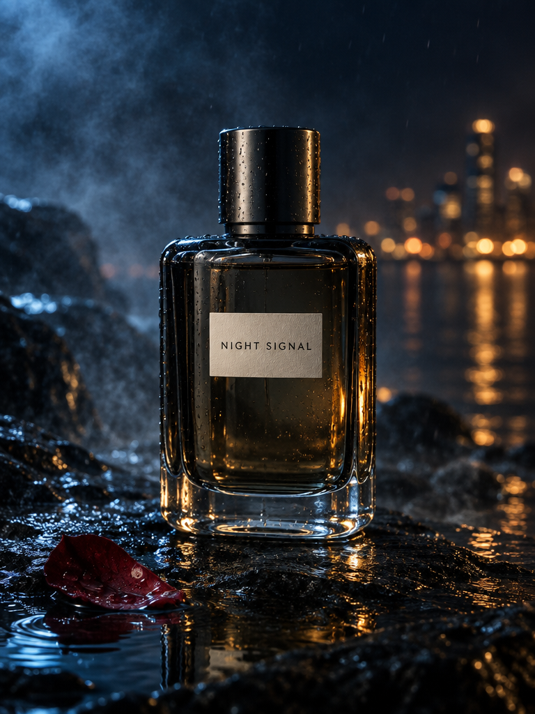
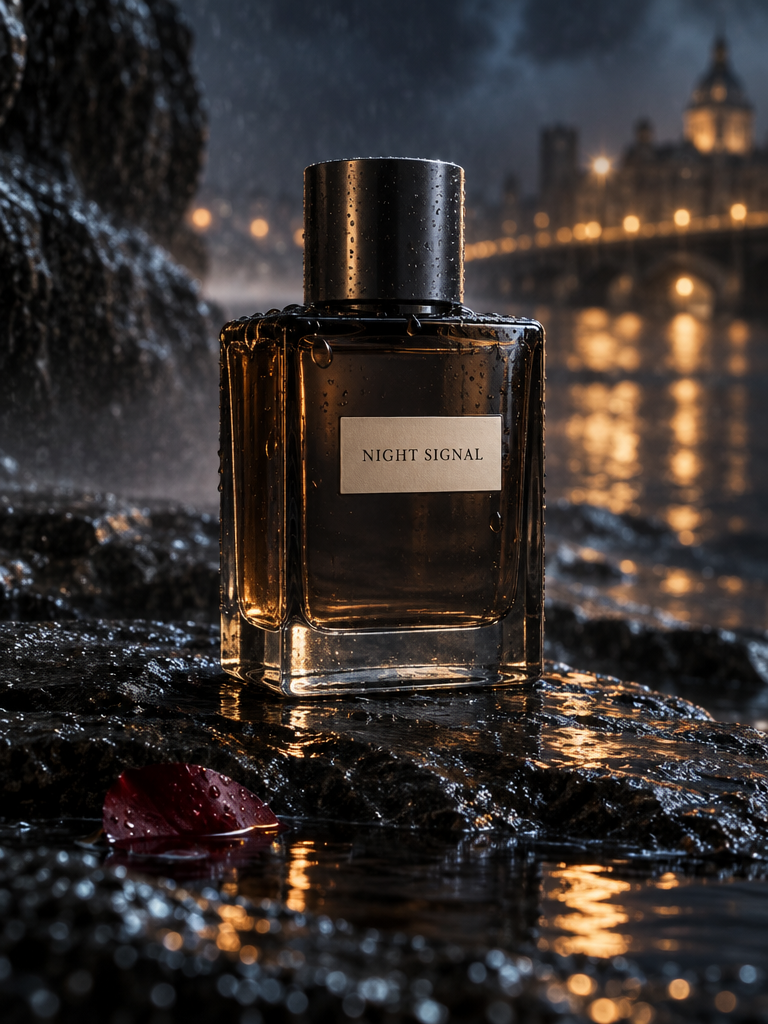
Both outputs keep the fictional NIGHT SIGNAL label readable on a dark bottle. Flare centers a smaller bottle against cool blue atmosphere; Sunburst makes the bottle larger, with stronger warm reflections and more visible droplets on the foreground stone. Inspect the full-size label and glass edges before treating either as final ad art.
Preview prompt
Create a premium advertising photograph for a fictional fragrance called NIGHT SIGNAL.

The bottle is rectangular smoked glass with rounded edges, a heavy transparent base, subtle dark-metal cap, and a small clean cream label reading exactly:

"NIGHT SIGNAL"

Place it on wet black stone at night.

Surround it with controlled atmospheric elements:
fine mist
small rain droplets
one partially submerged dark-red petal
soft reflected amber city light
subtle blue ambient light

The bottle geometry and label must remain clear and believable.

Luxury fragrance photography with:
real glass refraction
a…
Test 4 / matched prompt
Information design
A four-stage diagram tests exact labels and visual hierarchy.
Same prompt · Medium quality · 1024 × 1024 · Auto background · one generation per variant
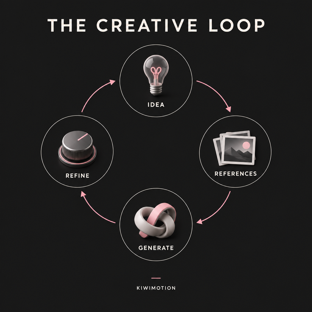
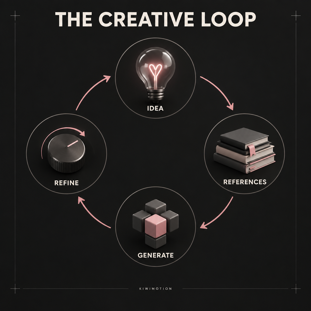
Both diagrams keep the title and four stage labels. Flare uses small cards for references and a ribbon-like generate symbol; Sunburst renders a book stack and cubes, with a more even circular arrangement. The symbols differ despite the matched information hierarchy, so review diagram meaning as well as the typography.
Preview prompt
Create a premium information-design poster titled exactly:

"THE CREATIVE LOOP"

Show four connected stages:

1. IDEA
2. REFERENCES
3. GENERATE
4. REFINE

Arrange the four stages in a clear circular workflow.

Each stage should contain:
one simple visual symbol
one exact label
one short directional arrow connecting to the next stage

Visual system:
dark charcoal background
warm off-white typography
restrained pink accent
thin technical lines
small polished 3D objects
clean modern grid
excellent spacing
clear hierarchy

All text must be perfectly readable.

Render each stage label exactly once.…
What we noticed—and what we did not test
The same instructions produced different framing, prop choices, lighting emphasis and diagram symbols. Both variants retained the headline or stage labels in these selected outputs. A single render per case cannot establish how often either variant gets small text or identities right. Our comparison also did not measure elapsed generation time.
When Flare makes sense
Start with Flare when speed and iteration are important; inspect the first render, then decide whether it meets your brief.
When Sunburst makes sense
Try Sunburst for demanding art direction, precise edits or complex layouts. Use the same prompt and settings if you want a meaningful comparison for your own project.