image prompt
No Curfew Streetwear Poster
by KiwiMotion · 180 prompts
Made with GPT Image 2
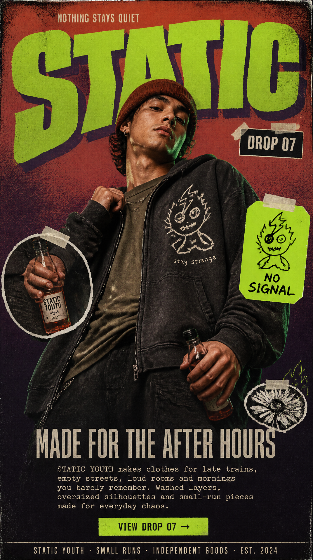
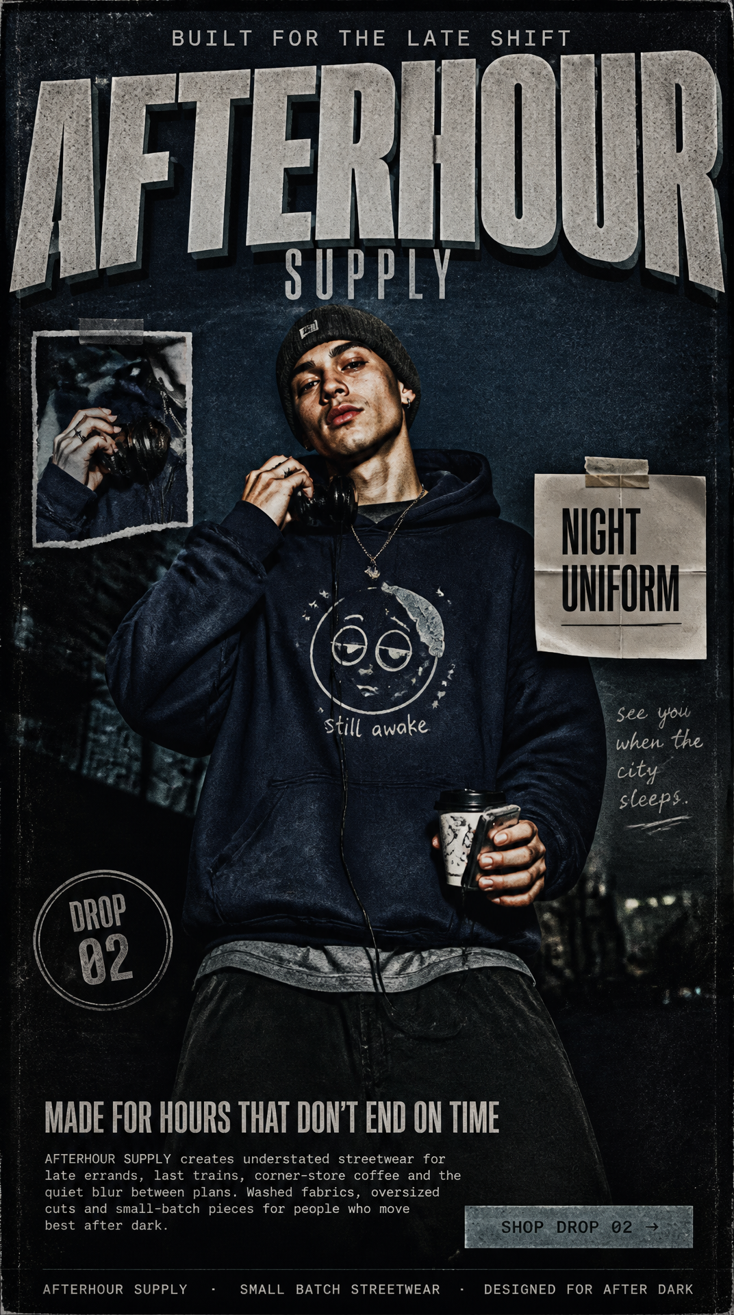
A square editorial streetwear campaign poster for the fictional label NO CURFEW DEPT., blending indie street-fashion culture, late-night youth energy, photocopied zine graphics, underground music-poster attitude, and polished contemporary editorial styling.
Prompt
Create a 1:1 square mobile-first poster-style landing page for a fictional streetwear label called “NO CURFEW DEPT.” The design should feel like a printed campaign poster that doubles as a landing page, blending indie street-fashion culture, late-night youth energy, photocopied zine graphics, underground music-poster attitude, and polished contemporary editorial styling. Format & Background Use a 1:1 square composition with a full-bleed background. Build the background from a dusty burgundy fading into deep brown-black, with subtle tonal transitions and a slightly smoky finish. Add tactile surface character: light paper grain faint photocopy noise soft ink inconsistencies tiny speckled print imperfections subtle edge falloff gentle poster-wear texture The overall surface should feel physical, printed, and slightly worn, not glossy or web-clean. Brand Header At the top, place a small uppercase line in pale beige: “OUT LATE BY DESIGN” Below it, feature a huge primary wordmark: “NO CURFEW” Typography should feel: wide and heavy bold but imperfect slightly rough at the edges influenced by bootleg concert flyers, varsity typography, and editorial street posters casually misaligned or slightly cropped for tension Use muted pale peach or dusty apricot lettering with a deep shadow in near-black brown. Below, add a smaller secondary label in condensed uppercase: “DEPT.” Keep the top area loud and recognizable, like a brand masthead on a collectible streetwear poster. Hero Portrait Place the main subject slightly to one side, occupying around half to a little over half of the square frame. Show a young adult in a relaxed streetwear editorial portrait, framed from about waist-up or upper-thigh-up. Wardrobe: oversized washed espresso-brown hoodie faded stone or vintage-grey T-shirt underneath loose dark pants barely entering frame knit cap or soft beanie in muted rust or clay minimal metal jewelry, such as a thin chain or ring On the hoodie, place an original rough graphic: a small sleepy star-face or doodled night-creature in off-white, with tiny hand-drawn text underneath that reads: “never early” Make sure it feels fully original and not connected to any real brand mascot. Pose & Expression The subject should feel natural and effortlessly cool. Pose direction: shoulders slightly turned one hand lightly gripping the hoodie collar, sleeve, or headphone wire the other hand holding a takeaway cup, old flip phone, or portable music player near the lower edge of frame relaxed posture with a slight slouch head tilted subtly expression neutral to faintly amused, with quiet confidence A little motion softness in one sleeve or hand is welcome to keep it feeling spontaneous. Photography Style Use realistic youth-fashion photography with: soft direct flash or flash-like illumination low-key ambient mood realistic skin texture subtle film grain gently muted contrast slightly shadowy background areas polished editorial sharpness mixed with analog imperfection The portrait should look believable, premium, and fashion-forward without becoming too glossy. Collage / Overlay Details Add 3 carefully placed collage elements around the portrait. Instead of many stickers, keep the overlays selective and graphic. Examples: a torn mini-photo crop showing the subject’s hand, accessory, or coffee cup a lightly creased paper label reading “AFTER DARK UNIFORM” a small circular stamp reading “DROP 05” an optional thin handwritten scribble, underline, or marker stroke Each overlay should have: slightly imperfect cut edges soft shadows subtle pasted-paper depth small tape corners or fold marks if helpful The collage language should feel curated and editorial, not chaotic. Lower Content Block In the lower part of the poster, place a compact headline: “DRESSED FOR THE HOURS IN BETWEEN” Use a condensed uppercase sans-serif in pale beige, muted peach, or faded cream. Below it, add a short block of body copy in a small serif or monospaced editorial font: “NO CURFEW DEPT. creates understated streetwear for midnight walks, slow mornings, last cigarettes, convenience-store lights and the strange quiet between plans. Soft fabrics, worn tones and small-run pieces for people who never rush home.” Keep the body copy secondary and neatly composed. CTA Add one understated call-to-action beneath the text: “SEE DROP 05 →” Style it as a simple pill or soft-corner button in dusty peach, faded sand, or muted clay, with dark text. It should feel integrated into the poster design, not like a standard online shop button. Footer At the very bottom, include a thin footer line in tiny tracked uppercase text: “NO CURFEW DEPT. · SMALL RUN STREETWEAR · MADE FOR LATE STREETS” Keep it subtle and aligned with the overall editorial grid. Color Palette Use: dusty burgundy deep brown-black espresso muted rust pale peach faded cream warm beige vintage grey Avoid green-led palettes from the original version. Typography Mix: one oversized display type treatment for the main brand name condensed sans-serif for subheads and labels a small serif or monospaced face for editorial copy loose handwritten marks or note-style lettering for small overlays The type system should feel collectible, raw, and fashion-aware. Mood Late-night. Printed. Youthful. Streetwise. Editorial. Independent. Quietly rebellious. Textural. Collectible. Understated but memorable. The final result should feel like a square editorial campaign artwork for a niche streetwear drop, equally suitable for Instagram, a digital lookbook cover, or a landing-page hero visual. Finish High-end Behance / Awwwards-quality art direction, realistic portrait photography, subtle analog grain, tactile print texture, smart visual hierarchy, and a controlled collage approach. Avoid: generic Y2K templates neon cyberpunk colors glossy e-commerce blocks fake app UI overdecorated sticker chaos childish graphics overly clean corporate layouts existing brand references cluttered navigation